
I’m not an artist. At least, not visually. Well, really what I mean is that I can’t draw. Don’t get me wrong, I can whip up a great layout on web or print or do UI any day, but when it comes to making… things? That’s really far from my strong suit. This weakness has made me shy away from game development generally, but it’s certainly not stopped my desire to make things. And I really wanted to make things on Playdate.
Trophy Case, for example, let me create something cool and useful but conveniently didn’t require anything in the realm of drawing or character design. It’s all UI! And I reckon it came out pretty good (could be better, and soon it will be, but that’s a story for another time). But when it came time to create the artistic assets for Hauler, there was no way to get around it.
That didn’t stop me from putting it off though! The gameplay of Hauler was well and truly sussed out before I ever sat down with my pixel brush out, so I at least had some hard guardrails to work within. After all, that’s part of what drew me to Playdate—if you’re making a PC game, you can do absolutely anything, and that counterintuitively makes it hard to come up with anything. But when you’re working with the hard limits of a yellow slice of cheese with a crank, you can come up with so much more while trying to really push the limits of the space.
First attempt
One such limit is the screen. At 400 pixels, I had 40 pixels to work with for each carriage of the train. Easy, right? Well, here was my first attempt:
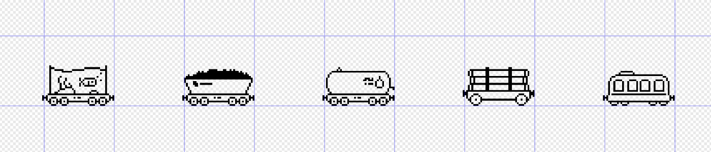
They’re pixel tracings of some actual images of carriages, so the proportions are more realistic. And they looked pretty good on a 13-inch display! But I got on FaceTime with my sister to show her and all she saw through the screen share was… four almost identical rectangles.
The thing is, train carriages are not designed to look good in a video game. They’re designed to fit as much as possible into the standardised footprint they have, so they’re all going to end up looking more or less like rectangles. And really long ones, at that.
I tried making them a bit taller to provide some more room for details:

Here, I’m trying to add more of the details I saw in the original reference imagery using the additional vertical space. Exaggerating the details did help, but this is still not really selling it. Testing on hardware is really important. Like, really really important. I thought I was onto something here, but on an actual Playdate screen these things are tiny. I mean, even I’m squinting, and I drew them!
And the thing is, I couldn’t find or come up with nine distinct kinds of carriage, so I started experimenting with more fantastical ideas—especially ones with unique shapes. Note the fishtank car and the circus tent car; they’ll come up again later. But for the first time, I had a full set of carriages—progress!
It’s a video game; things don’t have to look real.
Fast-forward a few weeks and I’m sitting in a GP waiting room. As always, it’s a little too cold, the TV is a little too loud, and the wait is a little too long. Now, I am keenly aware of the decline of my long-distance vision, so I really can’t make some things out from a distance as I used to be able to. Illuminated signs at night? They’re just about my worst enemy.
But across the waiting room, I ‘see’ two things that I could clock from a mile away: one of those wire toy things with the beads on it, and a wooden train set. I’m not talking about some little artisanal thing; I mean the O.G. The ones that come with the interlocking wooden tracks that seemed to endlessly capture my younger self’s interest and that never seemed to have quite the right combination of pieces to make the intersections work. Ah, a young boy can dream (of expansive rail networks)! And they have the magnetic couplers so you can pull them along the tracks and shunt the carriages and do all sorts of stuff. These ones:
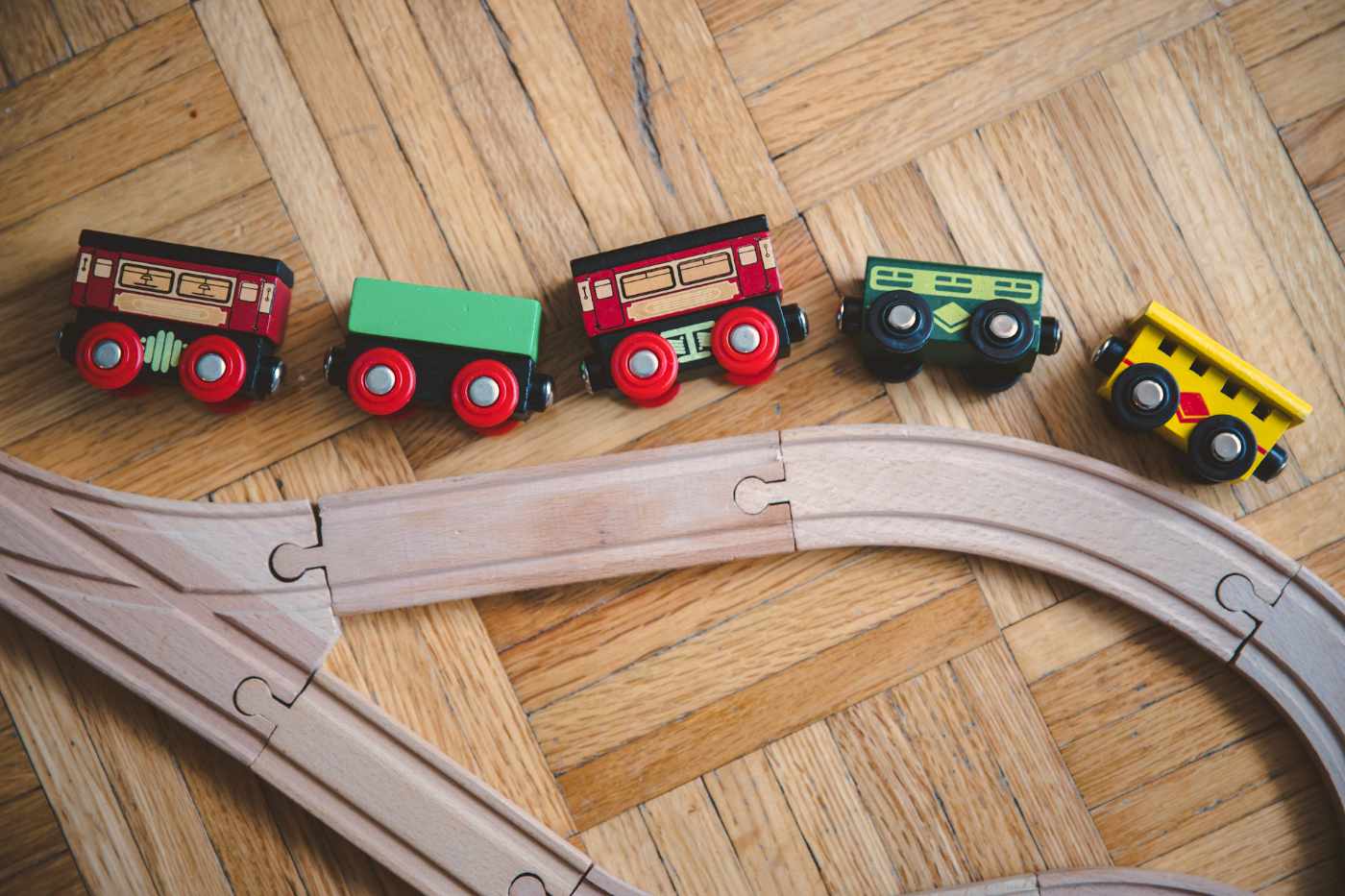
And while you can understand logically these are pieces of a train, they are a complete departure from any sort of realism; truly a caricature of a train. They have massively oversized wheels so that they can fit into the generous recessed rails and glide over the massive gaps in the track joints, and they’re all made out of chunky shapes that are easy to manufacture and cut up and paint.
Suffice to say that as soon as I got home I put these same design decisions to work on my own train set. The first bit I drew was the bogey—the same platform bit of the carriage that has the wheels and the connectors. If you’ve ever used content-aware scale in Photoshop, that’s what the carriages feel like. All of the individual components are ‘normal’, but the bits between them have been squished and squashed to fit into their 40-pixel box. And it worked surprisingly well. Starting off easy with the container carriage:
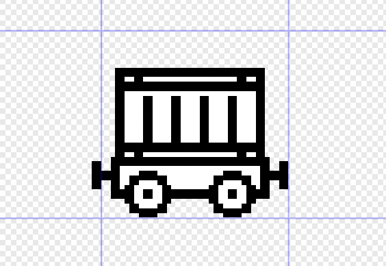
The decision to stick with a strict two-pixel stroke for the carriages wasn’t arbitrary; I took inspiration from the visual design of John Weachock’s Spilled Mushrooms. A stroke width that’s wider than a pixel gives you a lot of flexibility, too. You can have gaps between strokes that are less than a line wide, you can add curves that are smoother, and you can have shading that is much more convincing because the elements are finer than the strokes. Here’s a comparison:
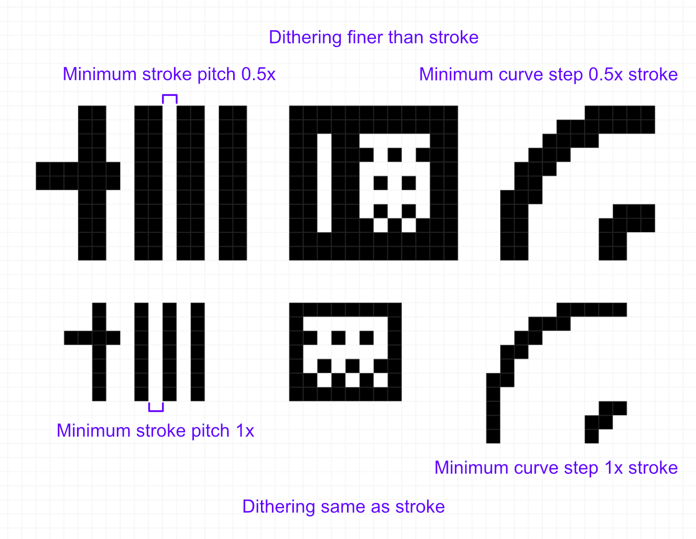
To be clear, these advantages have been retconned in and are something I noticed in hindsight, but they’re useful principles nonetheless! You may begin to notice this being applied in other places too, like in many of the included fonts in the Playdate SDK.
All in all, iteration 3 of the carriages ended up being more than twice as tall as the originals! With a bitmap loaded up on my device, I FaceTimed my sister again, holding the screen up to the camera. The way her face lit up immediately told me everything I needed to know.
Things still need to look a little bit real.
At this point I’ve clearly got a banger on my hands, but that doesn’t mean it’s all smooth sailing. One challenge in particular came in the form of the lumber carriage. It’s a stack of cylinders, strapped down onto the bogey. To make the shape clear, I’ve got to make them a bit oblique, but not too oblique, all within a narrow space and with thick strokes. The intersection of the three ellipses on the ends of the logs resulted in a big black blob with a few clear pixels—not good. It took me a whole day of hopeful stubbornness to eventually concede, and for a while I considered scrapping the design entirely.
The ends became frustrating and I kept coming back to them over a few days, but with a lot of fiddling and finagling, and reeeally fudging the geometry, I arrived at something that worked. Looking back, I’m really glad I kept at it, because the lumber car turned out to be one of my favourites.
I’ve written a lot so far about how challenging it was to visually communicate these carriages in the limited space and with all the constraints and so on and so forth. You should be able to tell all the carriages apart, but do you know what they’re called?
When other players are making moves, you’ll see a caption that explains the card they used and which carriage they used it on. But I noticed that when playing with other people, they struggled to remember or associate the names of the carriages with what they looked like. So why not add icons next to the name? Cards already have icons and they work to great effect. One problem: now I have to try and draw these carriages even smaller.
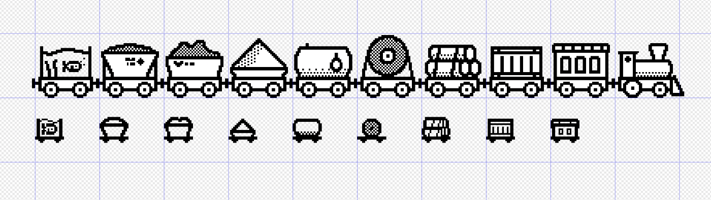
Dear reader, I truly wish I had some epic tale of artistic struggle and a breakthrough to share here, but I don’t. These are the first and final iteration. Somehow, under what sounds on paper like impossible constraints, these just popped right out. The icons are shown next to a caption which players only read briefly while watching the action, so they don't need to be perfect representations of the carriages; their distinct silhouettes paid off here where I just had to get the overall shape right, and then go back in with a finer stroke to fill in some of the small details.
Now, the lumber car may be one of my favourites, but it’s not the real stand-out. It blends in with the rest of the ‘real’ carriages (okay, yes, one of them is literally just a pile of sand, sitting loose on a plate. But it still makes a little more sense than the circus tent.), unlike the fishtank.
You may remember the fishtank from the first iteration of the carriages—well, it was an earlier idea to have all of them be completely absurd sets of cargo. My initial thinking was that removing the ‘restriction’ of having real cargo would make it easier to come up with unique shapes for the carriages. For example, the tyre carriage was initially going to be a magic 8-ball.
I think that reigning this back in was an important decision that helps to define the game’s personality—a little absurd, but fully committed to the bit. The fishtank tips the scales just enough in the right direction for my tastes[1].
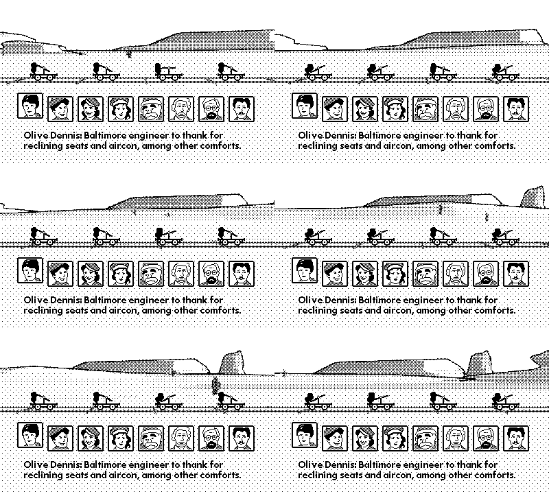
The background is always visible in Hauler. It really only serves to indicate that the train is moving, but boy is it important. It’s a 60-second loop of some nonspecific desert with harsh sun, gentle hills, and a few stray cacti (which were added later to show off that the fishtank and the passenger car are actually transparent). It’s mundane, but it really pulls its weight, and the dithered ‘soft’ look of the lines is an important contrast to the thick, flat foreground elements—the cards and the carriages.
Cars: Mater-National Championship
Racing my brothers and sisters as Guido and McQueen on the Xbox 360 is a fond memory I’ll always cherish. The percolation of that game’s immaculate vibes and nostalgia is really what I’ve carried with me while making Hauler, and while thinking about not just its visual identity but the feel of the game as a whole.
I’ve listened to the Radiator Springs theme on repeat for hours and I’m still not sick of it[2]. The UI sounds are immaculate too. I mean, the confirmation SFX? It’s a car door closing. Toggling things makes a little indicator sound. The kachow sound effect is my text tone. It’s good stuff, and you really should have a go if you’ve never played it before.
At the end of all this, I still can’t do anything that looks illustrated, and character design is definitely a beast for another day—or another game. Playdate is a welcome home for pixel art, something that I’ve definitely got the hang of. It has taken me a very long time to make Hauler, and yet, my enthusiasm hasn’t waned one bit.
Hauler will be available on the Playdate Catalog soon, and I hope you’ll have as much fun playing it as I did making it.
Turns out, I actually did have it in me to design another whole set of carriages. Maybe you’ll find them one day. I’m not kidding when I say Hauler is full of secrets! ↩︎
You might also hear some if its influence in the Hauler soundtrack, composed and produced by the incredible Zane Little. ↩︎